Case Study/ ScaleUp Institute
How do you educate businesses about the challenges of scaling up?
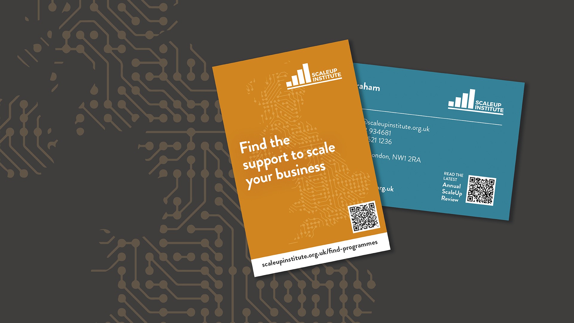
Founded by Goldman Sachs and supported by the likes of O2, LinkedIn and Google amongst others, the ScaleUp Institute is a private sector, not-for-profit company focused on making the UK the best place in the world to scale up a business. The Institute regularly reports on and provides insight into the scaleup landscape and produces a large-scale Annual Review.
The ScaleUp Institute faced organising a mountain of information on scaleups into a user-friendly format and design, with themes, sections and stories that were easy to navigate, digest, use and learn from.
Our creative formula: Reporting as a digital platform
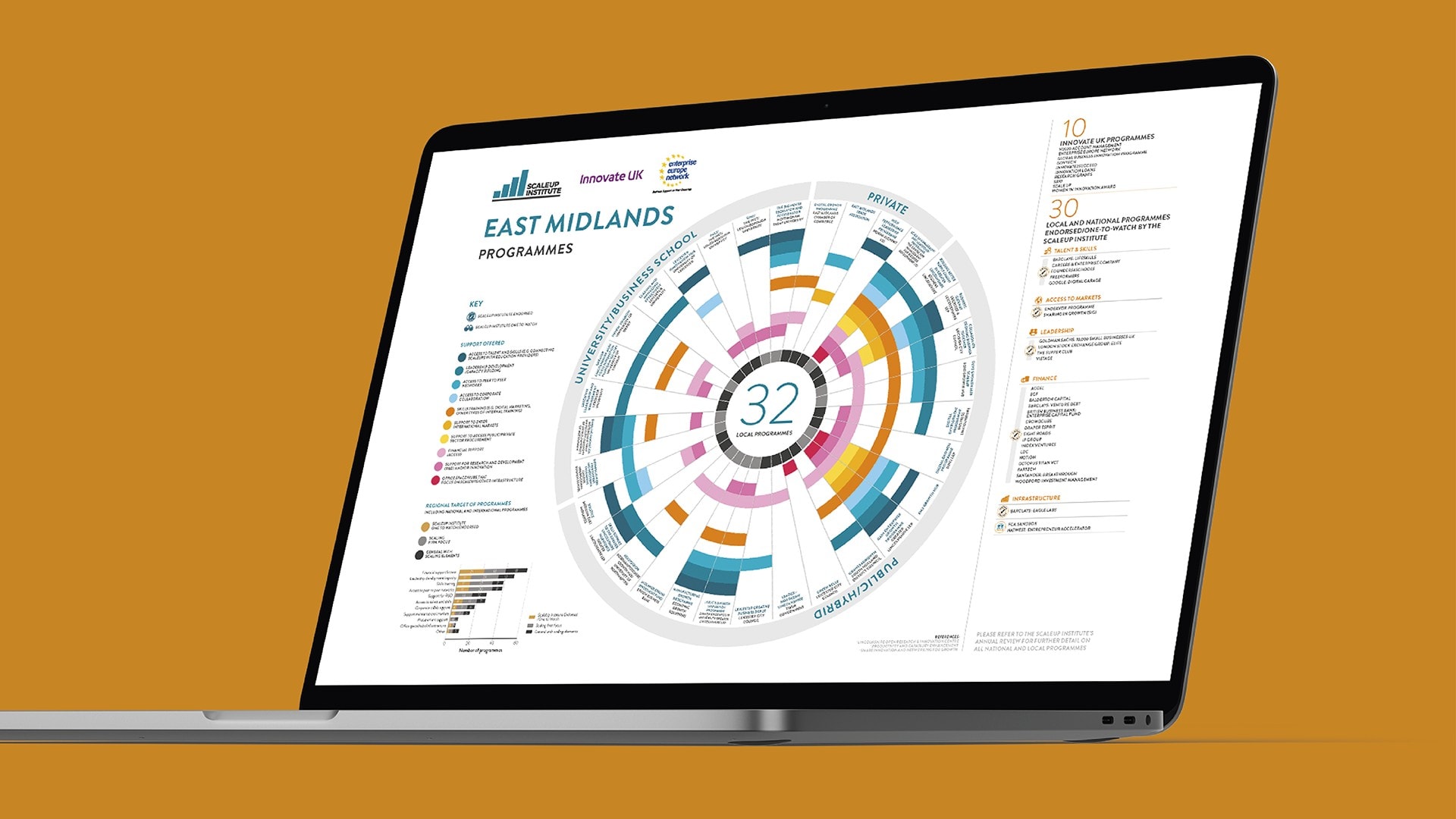
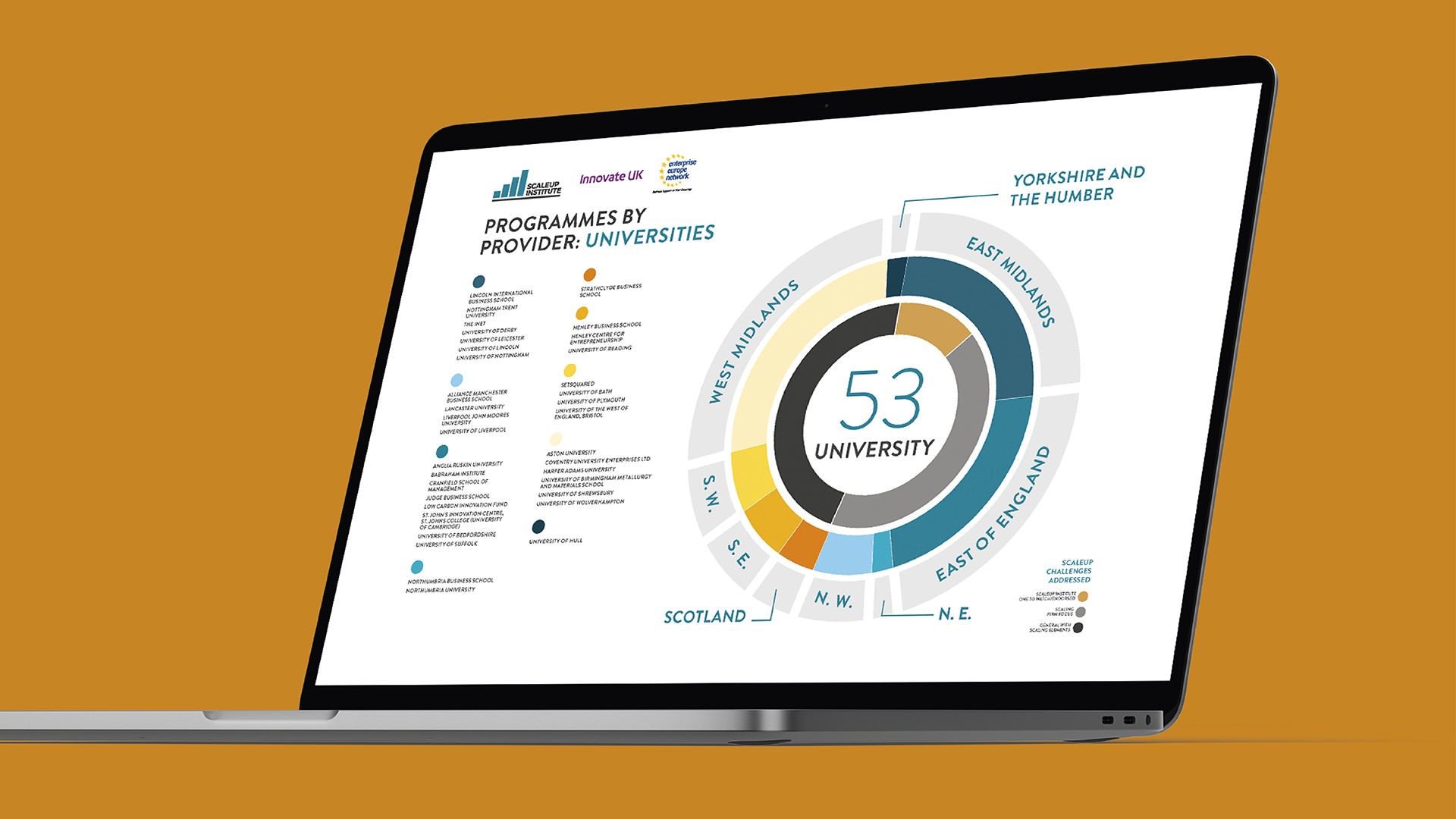
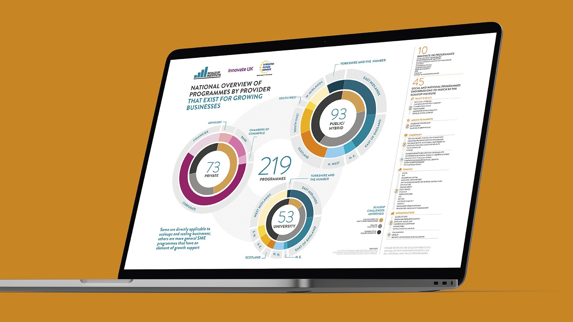
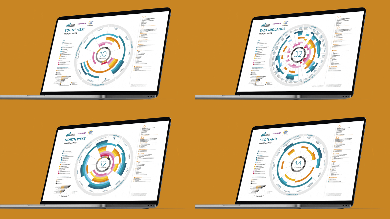
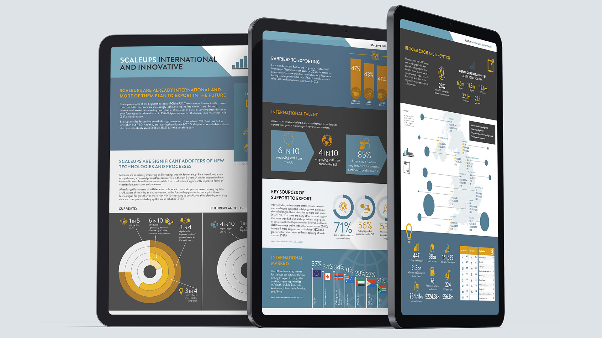
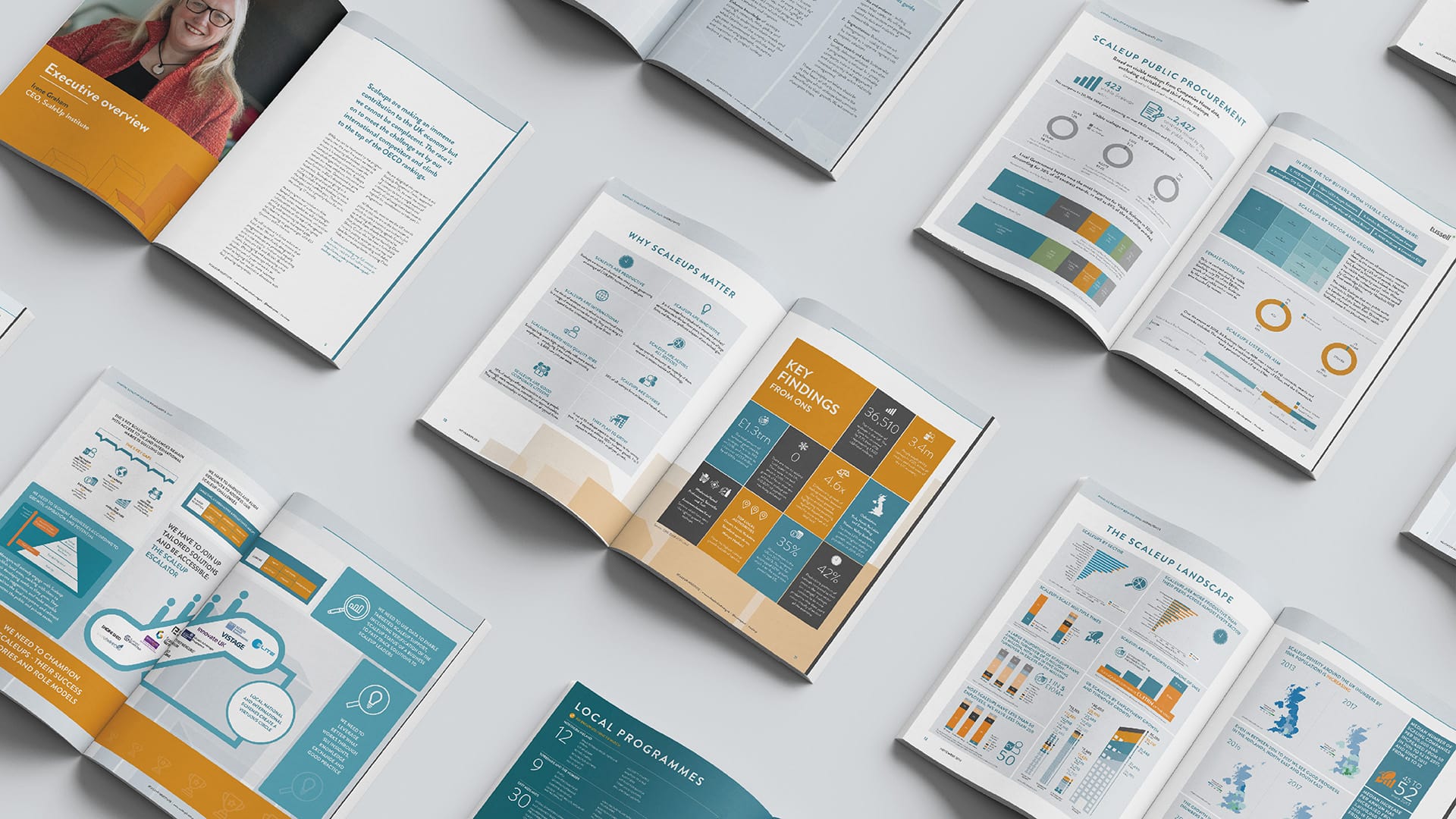
Leaning on years of experience of working with market research companies, we transformed huge amounts of data and insights into compelling graphic stories for the ScaleUp reports, starting with the, at 300+ pages, monster Annual Review.
We wanted people to be able to refer to the Review often and navigate quickly to locate information, while allowing it all to flow and make sense as a whole. We developed an extensive series of icons around major themes as well as a colour-coding system to signpost content. We also created an extensive series of data graphics, visualisations and infographics to guide people through key findings and insights.
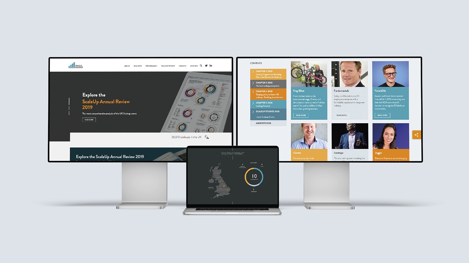
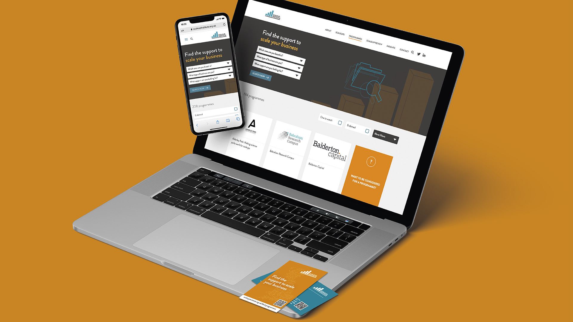
We later designed a platform to support UK (scaling) businesses and evolve the Review into a digital edition. With our digital partner, we created a website with an interactive Review component and Scaleup Business Finder tool: a data-driven dynamic map that visualises the 10,000 UK businesses that are classified as ‘scaling’.
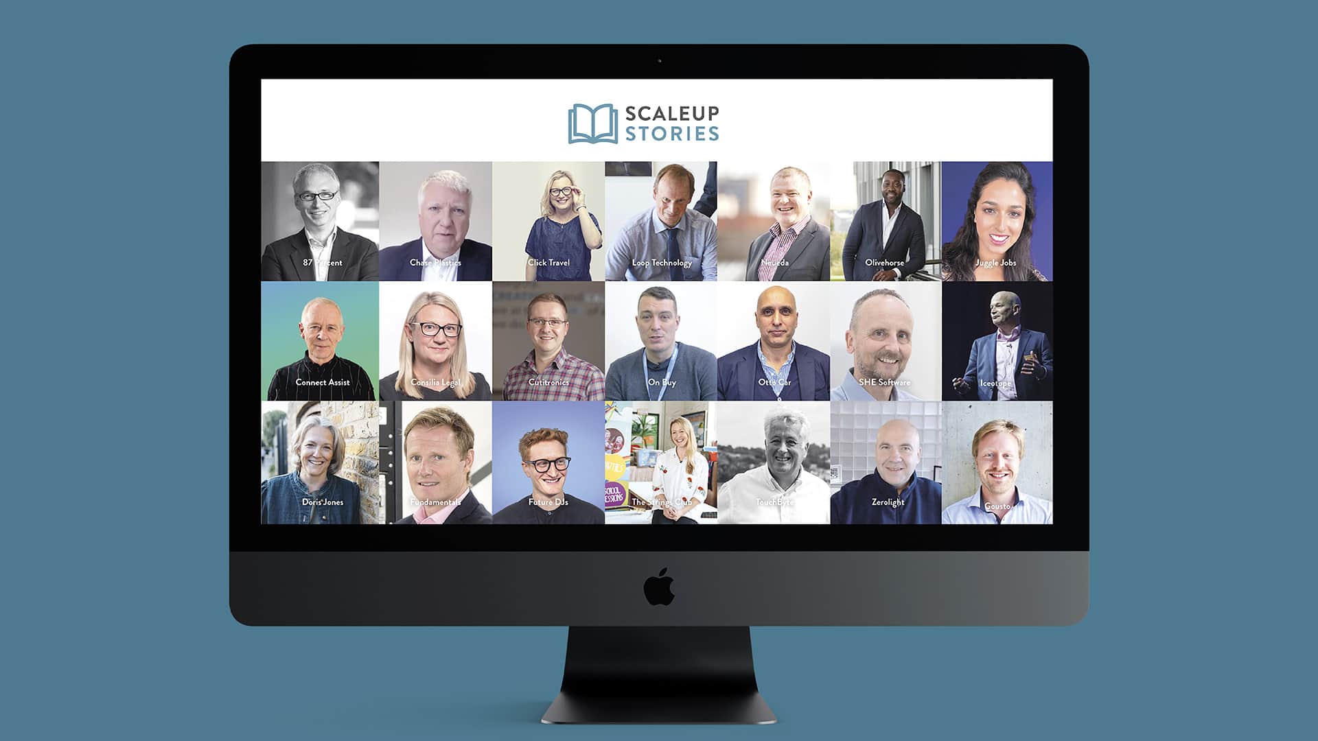
Additional magic: We continue to update the website and support the Institute across a range of digital marketing campaigns, including video accompaniments to and spinoffs from the Annual Report in the form of Scaleup Business Stories (case studies and interviews), animated graphics, infographics and data illustrations.
“It is a delight to work with a creative consultancy that really understands data and can covert this into compelling graphic stories. We work with an enormous amount of information, which we have to turn around and report on at speed to ensure decision-makers remain informed. NEO is responsive to our needs, the needs of our stakeholders and delivers against what can only be described as our extraordinary requirements and deadlines.”
More Magic
Top Tags
//
Creativity is a catalyst for connecting
people and ideas.
